Brand Guidelines
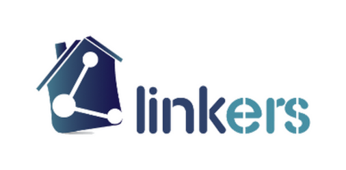
Linkers
Every connection, mapped.
Scroll
Every connection, mapped.
Linkers turns invisible networks — property, data, people — into something you can see and trust. The house-shaped node diagram doubles as a literal mark of connection: points linked into a single, stable structure.
The identity favors a deep navy-to-teal gradient that feels technical without going cold, positioning Linkers as the infrastructure layer serious platforms build on.
The primary logo should always appear exactly as shown — never redrawn, recolored outside this guide, or altered in proportion.
Maintain clear space around the logo equal to the height of the mark's icon on all sides. Never let text, imagery, or the edge of a layout enter this zone.
 Digital min · 90px
 Print min · 0.6in
 Recommended
A navy-to-teal gradient anchors the system — structural at the dark end, technical and fresh at the light end.
Sora's geometric precision suits product headlines; Inter carries UI copy and documentation with total clarity.
Small distortions compound fast. These four mistakes are the most common — and the easiest to avoid.
Don't stretch or distort the proportions.
Don't recolor outside the approved palette.
Don't rotate or tilt the logo.
Don't place on low-contrast backgrounds.
A quick look at how the mark and palette hold up across common touchpoints.